Reading Time: About 1 minute
When I was doing interviews for the release of Brand Real, I was frequently asked which brands are “doing it right?” It’s a tricky question. The response from most is “Apple.” I purposefully don’t say that. I look for great branding in unexpected places. And it was about this time last year that I started talking about Dollar Shave Club. Like many others, I was struck by the introductory video that went viral and made the company an instant sensation on YouTube. But I liked DSC for more reason than a clever video. I became a member and I was delighted by the consistency of branding at every touch point in the experience—from web to package.
Today I received the brand’s latest endeavor—a starter kit that includes a new product: Dr. Carver’s Shave Butter. Once again, the brand doesn’t disappoint. Here’s photos from the unboxing:
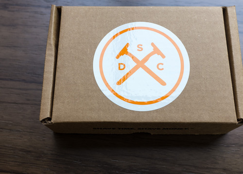
One year in, the brand keeps to its no-nonsense creative approach: cardboard and stickers. But it’s got personality.
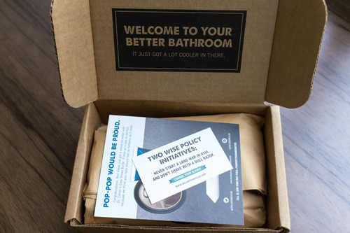
Once inside the box, the confident voice and familiar artifacts surface. I love the concept of a “better bathroom” for men.
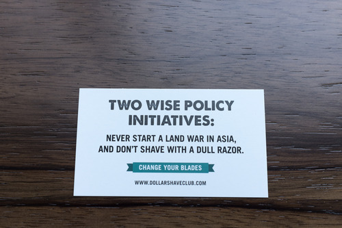
As I have come to expect every month, there’s the fortune cookie style message in a packing card. Agreed: starting a land war in Asia is unwise.
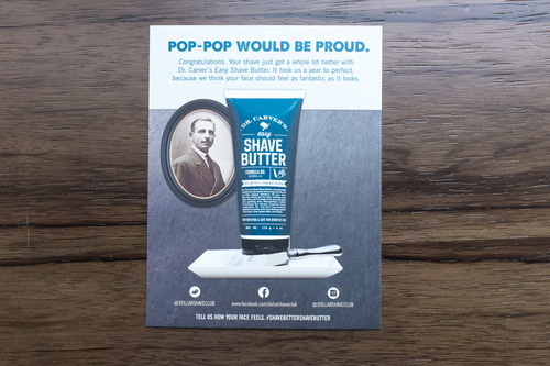
OK, brand storytellers, take note. At the end of last year I was asked to participate in a survey by DSC. It asked questions about how much of a fit a shaving cream product would be for DSC. Apparently members agreed with me and said it was a good idea. But the great branding bit here is a continuation of a thread in the YouTube video. Remember Pop-Pop? The “handsome-ass” grandfather who had one blade … and polio? He surfaces here with the introductory card on Dr. Carver’s Shave Butter.
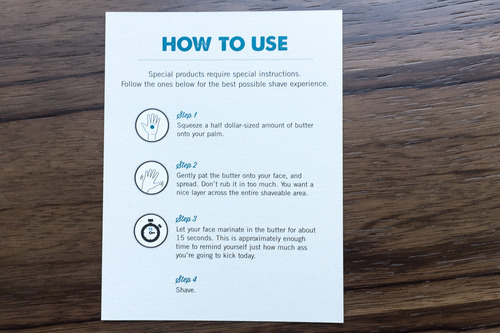
On the flip side of the introductory card is an instruction set, and again that tone of voice that hooked me at the start is alive and well. “Let your face marinate in the butter for about 15 seconds. This is approximately enough time to remind yourself just how much ass you’re going to kick today.”
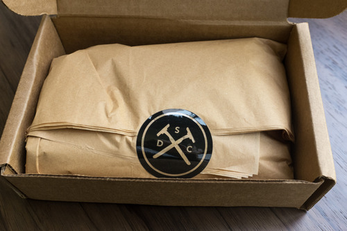
Cards out of the way, let’s see what’s inside. The sticker and tissue paper may be a bit much, but you’re a member so go with it.
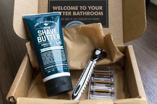
Everything on the inside sticks to the script. It’s clean design that consistently makes you feel good about taking care of your face. It’s not frilly and it feels like products of high quality.
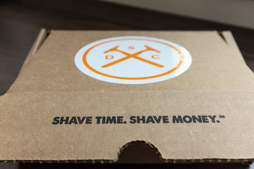
And the writer in me love’s the consistent tagline: Shave time. Shave money. This is a brand that exceeds expectations through product, through tonality, and through design.

